Reflection
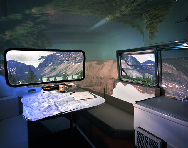
The artist name is Colin Smith and the piece is title “Bow Lake Boler”. I believe this piece of art was originally a photograph, but it was printed on archival paper with lightjet ink. The idea of this piece is to juxtapose two distinct environments by transforming a transportable house into a showroom. I think the piece is very engaging, because it shows how the outside and inside can be blended to create a flawless composition. The scenery outside the window is a beautiful lake, while the scenery set up on the inside of the house appears to look like a canyon. Despite the contrast in colour and environment, the piece comes together seamlessly, which is why I think this photo is very interesting.
Concentration Ideas
How we perceive the world as we grow
I want to draw a close up of the face of a person(maybe myself) from baby to adulthood wearing huge sunglasses. The main focus of the art piece will be the reflection on the sunglasses. As I grow up the style of the sunglasses will change as well as the reflection (different places of the world).When we are young we are more innocent, so what we see will be more colourful and simply, but we do not have a lot of experiences, which is why the background will be plain. In contrast, as we grow up the reflection on the sunglasses will become more complex and monotone (symbolizing how we perceive the world as we grow), but the background of the drawing will be more colourful (symbolizing the diverse experiences we have). I think it will be cool if I draw the faces with pencil and graphite, the sunglasses with pencil crayon, the reflection with water colour and the background with ink.
Language expresses the unique aspect of culture
I am thinking of drawing famous attractions around the world and the people in the picture will only be silhouettes. I want to fill silhouettes of people in different languages of well-known literature or song lyrics. For example, the background will be a nice landscape of the Eiffel tower and the people in the painting will be filled with lyrics from the song “Je ne regrette rien” by Edith Piaf. I think I can deliver the flavour and nuances of the culture with both their well-known architecture/ landscapes and literatures/ music. Perhaps, the landscape will be drawn with watercolour, acrylics and pencil crayons and the wordings will be written with black sharpie.
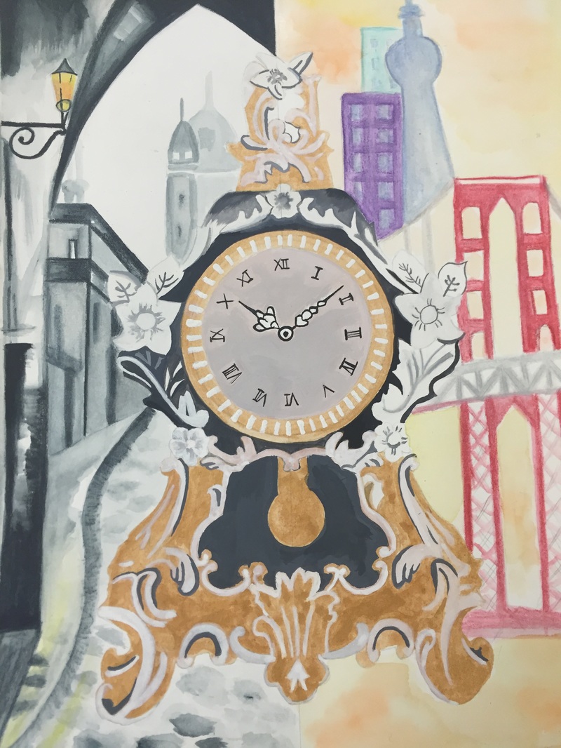
Reflection on University Challenge Piece
I chose to do the Carnegie Mellon “re-use” project. My project is not completely finished yet, because the materials that I was going to use did not work out as well as I thought it would be. I am endeavouring to experiment with other materials to make the art piece more detailed and intriguing.
I think the most successful part of the project was coming up with the idea. When I first approached the topic, I thought of “recycling” or“recontrcuting”things, which seemed a little boring to draw. After a bit more thought, I realized that antique is a form of reuse, so I decided to draw an aged clock and presenting the transition from the 80s to the modern time in the background.
I think the drawing will look better if I can distinguish the background and foreground even more. Right now, the antique clock does not seem like the focal point of the drawing and it blends in with everything else. Perhaps, I can add more detail or outline the clock to improve the drawing.
The biggest struggle for me is drawing the clock, because the curves and flowers took longer than I had expected. Also, ink is not a very tolerating medium, so blending the colours and drawing the details on the clock was quiet challenging for me.
Overall, I do think this project was fun and I was able to experiment with many different materials.
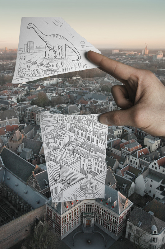
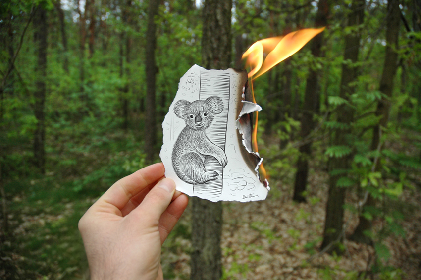
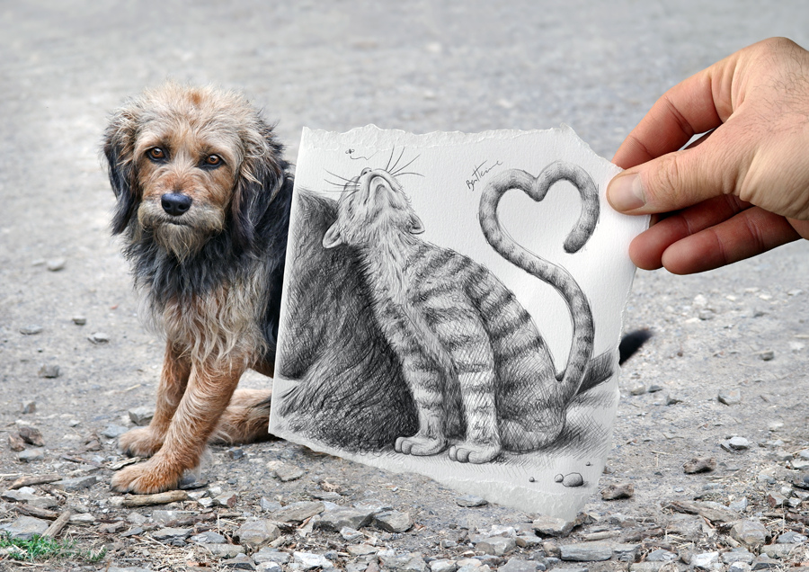
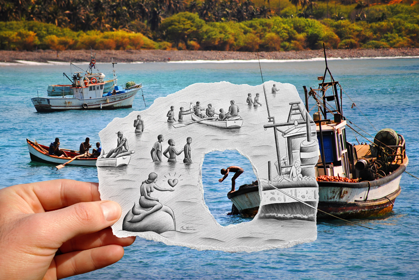
Ben Heine
Ben Heine was born in 1983 in Abidjan, Ivory Coast. Although he was born in Ivory Coast and attended University in the UK and Brussels, he rarely settled down at one location for work. He likes to travel around and draw whenever and whereever he has inspiration. One of his most famous series of work is “Pencil VS Camera”, which blends pencil drawing and photograph in a unique way. All of the work I have choose are all from the same series, which shows a lot of similarly. Every art work is a nice blend of drawing and photography and I think they are phenomenal. Most of the pieces from the “Pencil VS Camera” series explore the themes of love, freedom, after life, friendship and nature. Furthermore, Ben Heine not only focuses on pencil drawings, he also likes to paint with acrylics. I love his art and I think his ideas are amazing.